Match the payment form to your brand with CSS custom properties, and pick light or dark with the theme attribute.
The widget renders inside a shadow root, a private Document Object Model (DOM) tree that your page’s stylesheet cannot select into. Your CSS therefore cannot restyle the form directly, which is what stops a site-wide rule from breaking a payment page. One kind of style does reach inside: a CSS custom property set on the element itself. The widget publishes its whole palette that way, and this page covers the properties, the theme attribute, and the parts that stay fixed.
The brand colour is the accent ramp. Write the properties in a rule that selects the element itself:
leapa-customer {
  --leapa-accent-solid: #b8005c;
  --leapa-accent-emphasized: #9c004e;
  --leapa-accent-fg: #a30052;
  --leapa-accent-focus-ring: #d64c8c;
}
--leapa-accent-solid is the primary colour: the Pay button, the selected payment tile, the radio dot. --leapa-accent-fg is brand-coloured text, such as the terms link. Set the ramp and the widget follows:
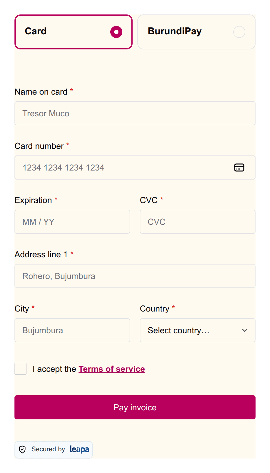
The background is not part of that. In light the widget is transparent and sits on whatever your page paints behind it, so colour the container, not the element. --leapa-bg is read only when the widget paints its own surface, which today means dark.
Set them on the element, not on a wrapper
The widget declares its own defaults on :host, which is the element itself.
Those defaults beat any value you set on an ancestor, so a rule on the
<div> around the widget changes nothing at all. Three places do work: a
leapa-customer { … } rule, a style attribute on the element, and
element.style.setProperty().
Check your palette against the contrast floors
Text needs a contrast ratio of at least 4.5 to 1 against the surface behind
it, and the edge of a control needs 3 to 1. The shipped values are measured
against those floors, so a palette you put in their place needs the same
check. Watch one pair in particular: --leapa-accent-contrast is the label
on the Pay button and --leapa-accent-solid is the button itself, so those
two have to stay readable together.
Names follow Chakra UI’s semantic token structure under a --leapa- prefix, so a Chakra path such as bg.subtle becomes --leapa-bg-subtle.
| Group | Properties |
|---|---|
| Surfaces | --leapa-bg, --leapa-bg-subtle, --leapa-bg-muted, --leapa-bg-emphasized, --leapa-bg-inverted, --leapa-bg-panel, --leapa-bg-error, --leapa-bg-warning, --leapa-bg-success, --leapa-bg-info |
| Text | --leapa-fg, --leapa-fg-muted, --leapa-fg-subtle, --leapa-fg-inverted, --leapa-fg-error, --leapa-fg-warning, --leapa-fg-success, --leapa-fg-info |
| Borders | --leapa-border, --leapa-border-muted, --leapa-border-subtle, --leapa-border-emphasized, --leapa-border-control, --leapa-border-inverted, --leapa-border-error, --leapa-border-warning, --leapa-border-success, --leapa-border-info |
--leapa-border-control draws the edge of anything the payer types or chooses in. It ships as an alias of --leapa-border, so changing --leapa-border moves both. Set --leapa-border-control on its own to give fields a heavier edge than the dividers around them, which is what it is there for.
Six palettes carry the same eight roles. Read <name> as accent, gray, blue, red, green or yellow:
| Role | Property |
|---|---|
| The filled control itself | --leapa-<name>-solid |
| The label on that control | --leapa-<name>-contrast |
| Text in the palette’s colour | --leapa-<name>-fg |
| Tinted grounds, lightest first | --leapa-<name>-subtle, --leapa-<name>-muted, --leapa-<name>-emphasized |
| The edge of a tinted block | --leapa-<name>-border |
| The focus ring | --leapa-<name>-focus-ring |
Accent has one extra, --leapa-accent-fg-muted, for secondary text on an accent-tinted row.
Each palette has one job:
| Palette | What it colours |
|---|---|
accent | Your brand. This is the one to override |
gray | Neutral controls and dividers |
blue | Information and progress, such as a “checking” notice |
red | Errors and declines |
green | Confirmations |
yellow | Warnings |
Blue is not the brand
The name is misleading and the mistake is expensive. blue is the
information colour, so setting --leapa-blue-solid recolours no button and
no tile. It fails silently, which is how a rebrand that looks correct on
paper leaves the Pay button untouched. Use accent.
Leave the three signal palettes alone
A payer reads a green banner as success before they read the words. Recolouring red, green or yellow takes that away and gives back nothing.
These are not colours, and they are set the same way:
| Property | Ships at | What it sets |
|---|---|---|
--leapa-size-control | 40px | Height of anything the payer taps |
--leapa-input-height | --leapa-size-control | Field height, if it must differ |
--leapa-input-px | 12px | Gap from a field’s edge to its text |
--leapa-input-font-size | 0.875rem | Text inside a field |
--leapa-input-start-size | 1rem | Room for a leading icon |
--leapa-input-end-size | 1rem | Room for a trailing icon |
--leapa-radius-l1 | 0.125rem | Radius of small controls |
--leapa-radius-l2 | 0.25rem | Radius of a field or button |
--leapa-radius-l3 | 0.375rem | Radius of a card |
--leapa-space-surface | 16px | Inset around a painted surface |
--leapa-shadow-popover | soft drop shadow | The one raised surface |
--leapa-size-control covers every field, every button and the consent row, so they cannot drift apart. --leapa-space-surface has a job only when the widget paints its own background, which today means dark. The one raised surface is the account list on the BurundiPay phone rail.
Do not lower --leapa-size-control
WCAG 2.2 SC 2.5.8 asks for 24px, so 40px already clears the floor by two-thirds. Below it you are shrinking the tap target on a payment form held one-handed on a phone.
The theme attribute takes three values, and leaving it out is a fourth behaviour:
<leapa-customer theme="light"></leapa-customer>
<leapa-customer theme="dark"></leapa-customer>
<leapa-customer theme="auto"></leapa-customer>
<leapa-customer></leapa-customer>
light pins the light palette, even on a device set to darkdark pins the dark paletteauto follows the payer’s device settingFollowing the device is opt-in rather than the default. The widget renders inside a checkout it does not own, so a merchant who sets nothing keeps the light card they have today. Without that rule, a version bump would turn the card dark for every customer whose device is set to dark.
In dark the widget paints its own background, because near-white text cannot sit on a page that is still white underneath. In light it stays transparent, as it always has.
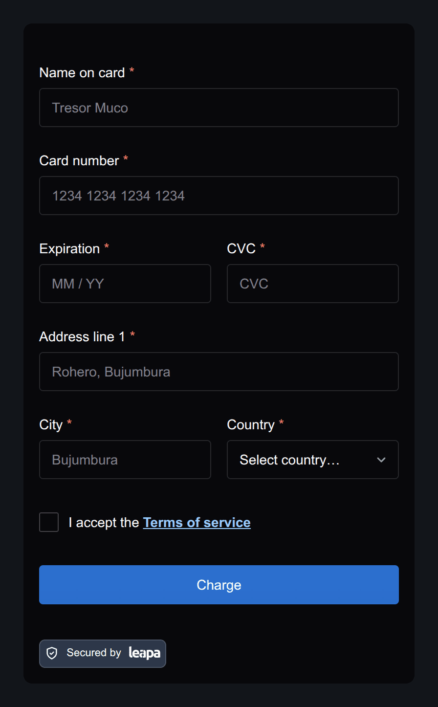
If your page drives its own dark mode with a [data-theme] wrapper or a class, that marker does not reach inside the widget. Set theme on the element from the same code that sets your wrapper.
Two things do not follow your palette, and both are deliberate.
The BurundiPay QR code sits on a white field with dark modules. Scanners assume that contrast, and a dark panel there produces a code that may not scan at all. The frame around it stays white in every theme.
The Secured by Leapa badge is fixed artwork. Pick badge="light" or badge="dark" for the chip behind it; the mark itself keeps its own colours in both themes.
The element sits in your layout like any other block, so size it from outside:
<div style="max-width: 400px; margin: 0 auto;">
  <leapa-customer id="leapa" api-key="your_api_key_here"></leapa-customer>
</div>
The widget lays itself out against its own width rather than the viewport’s, so it works at any width you give it. Leapa designs and reviews it at 320px, 375px and 480px.
A shrunken root font size shrinks the widget
The widget’s sizes are in rem, which resolve against your page’s root font
size. A page that sets html { font-size: 14px } renders every label in the
widget 12.5% small.
The element ignores these, so passing one has no effect:
button-color, button-text-color and label-colorlabel-* attribute, from label-email to label-address-zipUse the custom properties above for colour. Use lang to change the wording, which keeps English and French consistent. button-text is the one label attribute that survives, and it changes only the card form’s submit button.